Category: The Web

Digital Marketing KPIs

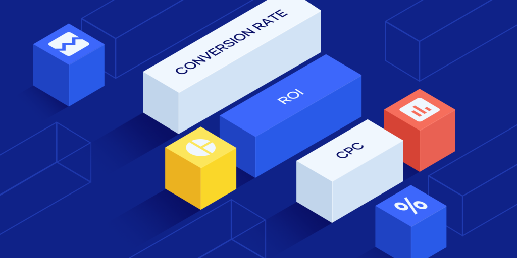
Digital Marketing KPIsDigital Marketing KPIs

The goal of setting up Digital marketing KPIs is to measure how many people are visiting your website. Many of these metrics will be similar, but some will be more specific than others. For instance, you might want to measure how many people are finding the information that they’re looking for on the first page, or the average time spent on your site. Whether you’re tracking this data for a blog or for a website, it’s important to set the right goals for each.

Conversion rate per keyword

Regardless of your marketing goals, tracking conversion rate is an essential digital marketing KPIs. It tells you how well your website converts visitors into leads and customers. Although the average conversion rate is around two percent, it can vary from one to ten percent depending on the specific site. Unfortunately, Google Analytics does not measure conversions after they are defined. If you are looking for an accurate conversion rate, there are a few things to keep in mind.

First, you need to know the source of your visitors. Knowing where people are coming from can help you determine which marketing efforts are working and which ones are not. Another important digital marketing KPI to track is the bounce rate. This metric tells you whether your site’s content is converting customers. If they are leaving without completing a purchase, it is possible that they didn’t find what they were looking for.

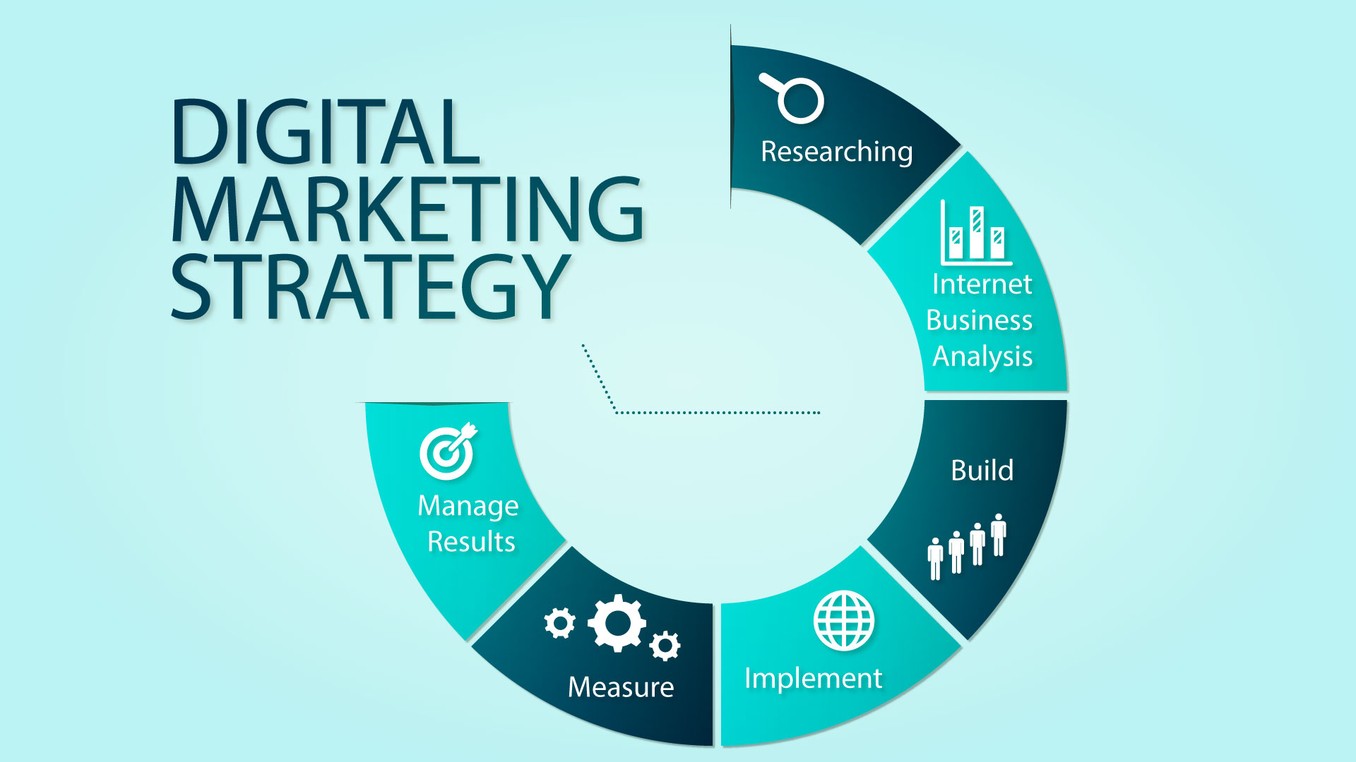
Related: How to Develop a Powerful Digital Marketing Strategy Template

Digital Marketing KPIs

Cost per acquisition

In digital marketing, lowering cost per acquisition is an absolute must. By lowering CPA, you’ll be able to get more leads for your money. While this is a highly important metric, it’s far from the only one that matters. There are other metrics, such as CPC, CTR, and RPM, that are equally important. But if you’re not familiar with digital marketing, you should learn about them anyway.

Cost per acquisition (CPA) is a measurement that captures the total cost of acquiring a customer. The term is most often used in reference to media spending. However, it can also be used in a more narrow context, like to determine the cost per acquisition for a single customer. It’s useful for evaluating the effectiveness of paid marketing channels. Lower CPAs mean higher profits. However, CPA doesn’t account for indirect costs.

Cost per click

Often abbreviated as CPC, cost per click measures how much advertisers spend for a single click in pay-per-click advertising. It is an important KPI for digital marketers who want to measure the success of their advertising campaigns and optimize them accordingly. It is calculated by dividing the total cost by the number of clicks. You can also view CPC on your Facebook, Instagram, or Google Analytics account.

While the cost per click is an important digital marketing KPI, it should not be your sole measure of success. Quality score and click-through rate are also important. The higher the quality of a visitor, the lower the cost per click. With these factors, it is possible to create a successful marketing strategy that maximizes return on investment (ROI).

Digital Marketing KPIs

Average time on page

If you are looking for ways to increase your conversion rate, you may want to consider improving your average time on page (TOP) in digital marketing. This metric consists of the total time visitors spend on a page, minus the time spent exiting. To determine your TOP, you will need to sign up for Google Analytics. The Behavior overview will show you which metrics are related to engagement. For example, if a visitor spends an average of six minutes on your page, that is a good starting point.

This metric should only be interpreted positively if it is the result of improved navigation or interactive content. Similarly, it should not be interpreted negatively if a user encounters technical issues. While the average time on page varies widely across industries, it is generally around 50 seconds for most. It is important to remember that this is a broad measure that shows the overall average user experience. In order to improve your average time on page, consider the following factors.

Return on investment

To measure the effectiveness of your digital marketing campaign, you must have clearly defined goals. Otherwise, you’ll be measuring the wrong things. A SMART goal is one that is specific, measurable, actionable, and time-bound. It should also be realistic and achievable. A good way to make the first step toward SMART goals is to start with a vague goal and work backwards. For instance, if you want to increase your traffic, make it more likely to result in a sale. Once you know your goals, you can create specific metrics to track and measure.

The return on investment (ROI) of a marketing campaign is an important metric for measuring the effectiveness of a strategy. This metric compares the amount of money spent on marketing campaigns to the profit generated by the campaign. Return on investment can help you determine whether your marketing efforts are bringing in enough revenue to make your business more profitable. In other words, they help you decide if your marketing budget should be increased or decreased.

How to Develop a Powerful Digital Marketing Strategy Template

How to Develop a Powerful Digital Marketing Strategy TemplateHow to Develop a Powerful Digital Marketing Strategy Template

In order to create a successful digital marketing strategy, you need to define your goals, your audience, your goals, and the means by which you will achieve them. This strategy should be accompanied by a marketing calendar that identifies the steps you will take to reach those goals. Ideally, your calendar will include one email campaign per month, as well as one social media campaign. You should also include your IT department, as they will likely have a great deal of input and knowledge when it comes to this.

Identifying your goals

A strong digital marketing plan template is made of several essential components. First, it identifies your goals. It will tell you what your business needs to succeed and where your efforts should focus. Then, you will have a plan to get there. A strong strategy will have SMART goals: specific, measurable, actionable, and time-bound. It will include your marketing goals, the types of channels that will achieve them, and other critical elements of a digital marketing plan.

Next, you need to identify the goals of your business. There are several ways to do this. One way is to set a goal for each campaign. Once you’ve defined your goals, you can write down specific actions and timelines. You can even include important keywords in your content to increase SEO. Your calendar should list out the types of content you plan to publish, including keywords and possible tags.

How to Develop a Powerful Digital Marketing Strategy Template

Choosing your primary channels

The first step in developing a powerful digital marketing strategy template is choosing your primary channels. You can use any number of different digital channels to promote your business, but successful marketers focus on the ones that connect most with their target audience. For example, a lifestyle brand aimed at millennials may concentrate on social media, while a B2B architectural firm might focus on websites, email campaigns, and other digital channels.

After choosing your primary channels, you can choose the best means of implementing them. If you want to promote your product or service through social media, you should create appealing social graphics to attract customers. You can use social media graphics templates available on sites such as Canva to create compelling social graphics. Moreover, social media campaigns can be easily monitored and evaluated. Once you have your business goals set, you can implement the right marketing solution and maximize its effectiveness.

Creating a marketing plan

A marketing plan serves as a roadmap for a company’s marketing activities. Proper planning can save time, money, and frustration. Here are some important tips to create a marketing plan. You should also create goals and set SMART objectives, which stands for specific, measurable, achievable, and results-focused. For example, your marketing plan should set out to meet a sales quota, improve brand awareness, or achieve some measure of growth. While your goals should be challenging, they should be attainable.

How to Develop a Powerful Digital Marketing Strategy Template

Once you’ve established your goals, you can focus on creating your marketing strategy. Choose three or four key objectives that are critical to the success of your company. Those goals should be related to increasing customer engagement, brand awareness, building trust, and improving the customer experience. Your digital marketing strategy template should also include metrics and KPIs for each stage of the sales funnel. This way, you’ll know how to measure success.

Working with your IT department

Building a powerful digital marketing strategy starts with the right technology. To achieve success, you must work with your IT department to set up the right tools and resources, and identify tech roadblocks to avoid. A good digital marketing strategy template should include core elements such as audience, goals, and means, as well as a simple calendar for your campaigns. In addition to creating a powerful template, it is important to establish KPI targets.

13 Simple Responsive Web Design Tricks & Tips13 Simple Responsive Web Design Tricks & Tips

13 Simple Responsive Web Design Tricks & Tips

Nowadays, responsive web design is essential. Your company cannot afford to maintain a non-responsive website given the growing number of individuals who use their mobile devices to research products before making purchases and to stay up to date on the latest news.

Additionally, Google’s preference for mobile-responsive websites in their search algorithm makes it clear that responsive design is here to stay. The advice for responsive web design offered in this article will assist you in creating a visually appealing and functional website if you’re just getting your site up and running. Additionally, the same advice is helpful if you’re rebuilding an already-existing website.

How to Use Responsive Website Design

You may ensure that your website is responsive and mobile-friendly by using the following design recommendations for mobile websites. Some of our top suggestions for responsive web design are listed below:

1. Understand how your customers use mobile

Recognize that users will interact with webpages differently on desktop computers compared to mobile devices. To determine why users are accessing your website using a mobile device and which pages and aspects they access the most, think about conducting a survey of your website visitors or employing analytics. Your understanding of which pages and other components of your website should be easily accessible on smaller displays will be aided by the information provided.

For instance, it would be a wise decision to ensure that your Contact page appears on mobile navigation if someone were to quickly search your website for your contact information.

2. First, plan your design.

Planning the layout beforehand will help while developing your website. In reality, before beginning the coding portion, the majority of web designers first create the website’s visual design and wireframe. It will be simpler for you or your designer to alter the template and incorporate it smoothly with your brand, which will help you get the exact appearance and feel that you desire.

Make sure to develop numerous website prototypes and test them on various screen sizes to ensure the final design will be responsive. The following are a few tools you may use to make responsive prototypes:

Adobe Edge Reflow With the aid of Adobe’s tool, you can visually design a responsive website by turning Photoshop files into HTML and CSS and modifying the design using mobile breakpoints.

— InVision. Your website can include interactive prototypes thanks to InVision. With a link, users may test the menus, buttons, scrolling, and more and provide comments. It’s an effective tool for seeing how your website would operate in various scenarios.

– Wirefy. This tool is useful if you want to base your design first on your content. You may utilize a responsive grid and make a wireframe for your website without having to manually compute widths and percentages.

3. Use navigational caution

The most crucial element of every website is the navigation. It acts as a guide for your visitors and makes it simple for them to navigate to different pages on your website. Your navigation will typically include prominent connections to all the key pages on the desktop versions of your site. On mobile devices, it is customary to utilize a hamburger icon and conceal the links inside of it.

This isn’t always the ideal strategy, though, as some users could forget that they have to click the icon to expose the menu and end up dissatisfied because they can’t access other pages. It would be preferable to use the hamburger menu for the remaining links while keeping the most crucial menu items accessible on all screen sizes. To make navigating easier, you can add connections to other sites in the text on your homepage.

4. Improve Images

The design of your website heavily relies on images. They can assist you in establishing an emotional connection with your visitors and help them picture the goods they want to purchase. Because of this, it’s critical that your photographs are optimized for the web.

This indicates that the photos need to be saved in the proper format, such as JPG for scenic or photographic images and PNG-8 for icons and logos that need a transparent backdrop. Additionally, you should use a tool like Tinyjpg to decrease the picture size and think about choosing images that are suited for different mobile breakpoints to lessen scaling and bandwidth difficulties.

5. Think about a mobile-first strategy

A different strategy for responsive design is to first create a mobile version of your website. This gives you a chance to preview how the graphics, text, logos, and other components will appear on smaller displays. If they appear correctly, you shouldn’t have any trouble scaling your design for larger screens.

6. Become familiar with media queries

When CSS was first proposed, media queries were first conceptualized, but they weren’t implemented until browsers gave them official support in 2012. Media queries’ primary use is to enable you to adapt your website’s layout to different screen widths.

The content will react differently on particular devices when media queries are used. In a nutshell, a media query will determine the resolution, width, and orientation of the device and show the proper CSS rules.

7. Include Keyboard Triggers in Forms 

Of course, your website’s forms should adjust to the width and height of the screen. You may go one step further, though, and make sure that the input areas activate the appropriate kind of keyboard. You can achieve this quickly by adding an input element to your form fields.

Name, email, address, and other text-input fields should be triggered by a text keyboard, whereas any input field requiring a number should be triggered by a numerical keyboard. This enhances both your website’s overall mobile friendliness and user experience.

8. Make Sure Buttons Are Simple to Click on Smaller Screens

Don’t forget to give the buttons on your website particular consideration. Since screen space is so limited, it’s simple to fall into the trap of making your buttons smaller so they will fit on the screen. But it also makes it more difficult to click on them.

Make sure your buttons are simple to identify:

– Use color to distinguish them from the other text on the page.

– The button should be represented by a rectangle or a circle.

If your button is large, you might want to use padding to extend the clickable area. For accessibility purposes, you can also adhere to the Material Design standard and make sure your buttons are 36dp tall. (1dp = 1px).

9. Boost Typography

You should make sure that the text is readable on smaller displays when using text. 16px or 1em is a reasonable size for body material; beyond that, size your headings appropriately. You should also increase the line height of your text to 1.5 em to give your paragraph lines adequate space to breathe.

Use a legible font as another piece of advice for designing mobile websites. For body copy or menu items, stay away from decorative or script fonts because they’re difficult to read, especially on smaller displays.

10. Utilize microinteractions 

Utilizing microinteractions is one of the main trends progressively permeating web design. For the bulk of corporate websites in the past, animations and interactive features would have been viewed as “nice to haves.” The usage of animations has, however, truly shot to the forefront as designers have grown hyper-focused on user experience, particularly in forms.

Instead of restarting the page—which can increase your bandwidth usage—they give visitors rapid feedback, which is especially helpful on mobile devices.

11. Implement frameworks

If you incorporate a responsive framework into your workflow, you can save a ton of time while building a responsive website. If you want to create straightforward, static websites, an HTML template using a framework like Bootstrap is a good place to start.

If you want to create a more complicated website and incorporate blogging into your marketing approach, you may also benefit from readymade responsive WordPress themes. If you want to do everything yourself but aren’t an experienced programmer, frameworks like these are an excellent option.

12. Adhere to minimalist design

The popularity of minimalist design has increased over the past several years, and for good reason. It clears out all the clutter, helps visitors concentrate on your content more easily, which increases conversion rates, and speeds up the loading time of your website by utilizing less elements. It also works well with responsive web design since it can be used to draw attention to your calls to action and emphasize crucial portions of your website.

13. Verify That Your Share Buttons Aren’t Preventing Access to Your Content

Including share buttons on your website can increase traffic and help your content become more visible. However, sharing buttons frequently hide your material, making it difficult to view on mobile devices. Check the share buttons on a mobile device to see if they scale well, or you might want to disable them on screens smaller than 768 pixels.

These Responsive Web Design Tricks and Tips Will Help You Advance

Making a responsive web design is now required. A requirement, really. Responsive web design makes it simpler for everyone to access your site without any problems and can have an effect on your brand’s reputation and conversion rates. You can make your company website look fantastic on any device your visitors use while also ensuring they have a pleasant user experience by using the responsive web design tips and tactics mentioned above.

Markustudio is a Manchester-based graphic and web design studio that specializes in site design, logo branding, print design, and digital design. We love working with successful small businesses and big brands across the UK as a web design firm. If you are interested in any help when it comes Web Design & Development. Feel free to Contact Us

List of Ruby on Rails Developers that you can HireList of Ruby on Rails Developers that you can Hire

Gas Light

Gas Light is a Ruby on Rails developer service provider. Gas Light is a team of experts who help to develop solutions that provide better business opportunities.

Gas Light’s professionals maintain full transparency, which aids their clients in making better business decisions. RoR developers update clients on project progress regularly.

Gas Light believes that understanding the business objectives and requirements of their clients is key to creating the right system. As they gain greater clarity on the customer’s goals, the experts at Gas Light help to improve the solutions and develop the system.

Simple Thread

Simple Thread, a Ruby on Rails developer company, focuses entirely on the exchange of design and engineering. The company has 10 years’ experience in providing mobile and web app solutions, as well as custom software development solutions. Simple Thread has the ability to design and implement systems that will help businesses reach their goals efficiently.

Simple Thread’s professionals believe that software isn’t just about coding. Software should also be about people. Simple Thread’s professionals discover the needs of their customers and create products to meet them.

Made Tech

Made Tech was founded in 2012 and is a well-known company in the tech industry. It’s a tech company with a lot of experience in helping startups create digital products using agile and lean principles. They are well-respected for their expertise in Data, Technology, Digital, as well as other digital techniques.

Made Tech leads the public sector in accelerated delivery and modernized apps. They have made smart decisions that resulted in improved technical skills and better data for their teams. Made Tech’s development team assists communities in adopting digital capabilities, skills and terms of delivery.

Made Tech has Ruby on Rail members who specialize in DevOps. Continuous Delivery. Continuous Delivery. Agile. Agile Transformation.

Gramercy Tech

Gramercy Tech is a top Ruby on Rails development company. They put a lot into creating best-in-class products. This company’s specialists are always willing to tackle new challenges and amaze their clients.

Gramercy’s team includes 35 developers, programmers, designers, and programmers who have extensive experience in concept design, creation, as well as software development. The company’s developers are keen to explore new technologies and help clients with their projects. They maintain a high level of professionalism and are disciplined.

Gramercy experts always deliver solutions or products to clients on time. The experts of Gramercy bring the client’s ideas to life through their digital experiences. The Ruby on Rails development company is a tech-passionate place with a fast-paced, friendly work environment. This encourages RoR developers and helps them create exceptional products.